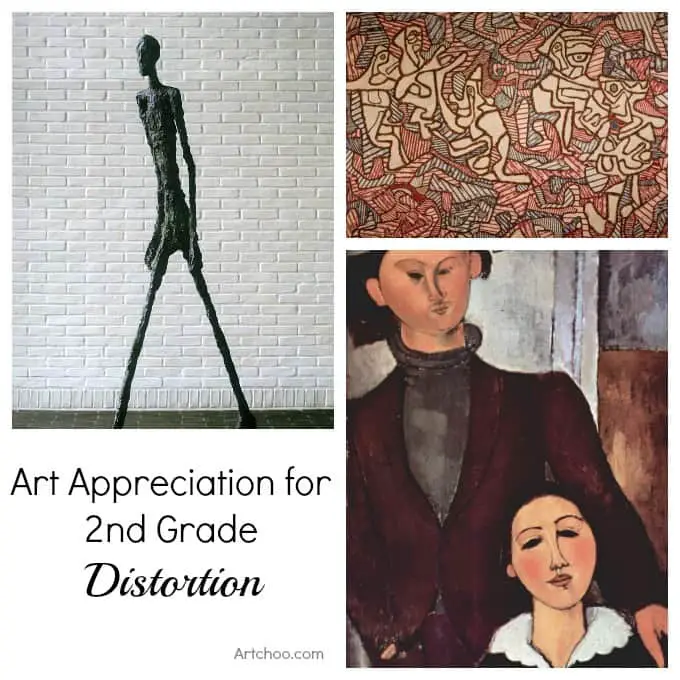
This is an art history presentation the kids get excited about because it’s fun to look at how artists use distortion in their work- just check out that crazy Giacometti sculpture below, and see what they have to say about it!
*****
Artists use colors, shapes and lines in their works; these are called the elements of art. But often they change or exaggerate the natural colors, shapes, or lines to better express some feeling or idea. By looking at works of art done in a distorted manner we can figure out what ideas or feelings the artist was trying to express.
Artists don’t have to record exactly what they see – the camera does that. Artists are free to depict whatever they want to in whatever manner they like; they can use their imaginations. They often do so with distortion so that they can better express some feeling or idea.
Note: All artists use distortion to some degree. For instance two artists painting the same tree- one may emphasize the sunlight on the leaves, another might emphasize the size and shape of the tree in relation to its surroundings. The finished pictures would look different.
Talk about: Distorted colors, shapes, and lines. Ask the children what is distorted in the pictures. Let the children point it out first. Ask them what they think the reason is for the distortion; what the artist was trying to express or to say?
Conclusion: Challenge the children to look for other works of art in which the artist has distorted actual shapes, colors, and lines. Ask them if they have ever distorted shapes in their own drawings.
Walking man, Alberto Giacometti by andreeastoica on Pictify
Walking Man, Alberto Giacometti, 1960, bronze sculpture, Art Institute of Chicago
Ask the Children:
How has this bronze sculpture of a Man Walking been distorted or changed?
- Arms and legs are much longer and thinner than normal
- Artist has said he wanted to show a lonely man- does the distortion of the body parts help show the idea of loneliness?
- The thin body, hunched shoulders, and the long legs and arms all work together to show a person who is all alone.
Talk About: Distorted colors, shapes, and lines.
- Is this bronze color (a greenish-brown) the natural color of a man? The use of the metal bronze is a distortion or a ‘change’ in natural appearances.
- The distortion of shape and line are easy to see here. The sculpture is almost six feet tall (about life-size) but the shapes appear to be much thinner and longer than normal. The arms and legs have been stretched into long, thin lines.
- Does the man have any knees?

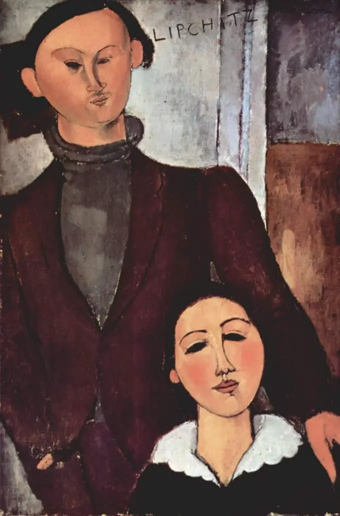
Jacques and Berthe Lipchitz, Amedeo Modigliani. 1916. Oil on canvas, 81.3 x 54.3 cm. Art Institute of Chicago
Amedeo Modigliani only lived for 36 years but in that time he produced a large number of paintings. He worked as both a sculptor and a painter. The human figure was something he liked to draw and paint.
This painting is of another sculptor, Jacques Lipchitz and his wife, Berthe.
Questions to Ask the kids:
- How has the artist distorted or changed the figures? (The woman looks graceful and gentle but the man looks tight and pinched)
- Why do you think it was painted this way (maybe the artist did not like the sculptor or was trying to say something about his personality. What do you think?
- Ask them if the figures look realistic
- Simplified shapes of the faces, eyes, etc.
- Flattened out colors/shadows- almost like masks
- Outlines around figures. Do people really have outlines around them (the outline is a distortion that emphasizes the simple shapes.)
Background Information (for the presenter):
This painting is at the Art Institute of Chicago. Amedeo Modigliani (1884-1920) was an Italian artist who moved to Paris at the age of 12. He was influenced by the smooth oval faces of primitive African masks that he saw in museums there. Jacques Lipchitz did not like the portrait that Modigliani painted and got rid of it as soon as Modigliani died.

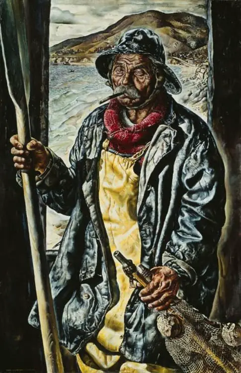
Heavy the Oar to Him Who is Tired, Heavy the Coat, Heavy the Sea, Ivan Albright, 1929, Art Institute of Chicago
Ivan Albright was born and lived here in Chicago. The Art Institute of Chicago has a gallery, or a large room, filled with his paintings. He is known for painting drooping flesh and aging skin and lots of details.
His paintings often have long, complicated names.
Questions to ask the Kids:
- Does this man look tired? Does his coat and the sea look heavy?
- How has the artist distorted things in this painting? (Talk about deep, large lines and exaggerated wrinkles in his skin)
Talk About:
The colors have a wet, silvery look to them. The shapes are not that distorted. It is the details that are distorted: the wrinkles in the face, the folds in the coat, the waves in the sea, the clouds in the sky. They are exaggerated. The lines in the man’s face are deep and exaggerated. All this distortion gives a feeling of weariness and age.

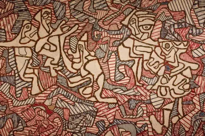
Genuflection of the Bishop, Jean Dubuffet, 1963, Art Institute of Chicago
Questions to Ask the Kids:
- What do you think this is? Is it a scribble design? Is it a jigsaw puzzle? Is it a picture of a person?
- There are supposed to be 5 human figures in this painting. See if kids can find them (It may help to look for the eyes)
- How can we tell these are humans? (They all have a face and the figures are white, not filled in with lines.)
- Can you find the figure that is genuflecting? (kneeling)
- Do you think you could make a design like this? How would you do it?
Talk about:
- The colors are a distortion because human figures are not really red, white, blue, and black.
- The shapes and lines of the people are distorted (changed) but we can still recognize them because of the eyes and their general positions.
Background Information (for the presenter):
This painting is at the Art Institute of Chicago. Jean Dubuffet (1901-1985) was a French artist who liked to doodle with ball-point pens and felt-tip markers. He produced free-form images outlined in black and filled in with lines and shading. Dubuffet then began to experiment with paintings using a similar technique in oil paint. In the 1960’s Dubuffet extended this technique to produce sculpture, drawings, and animated events, all based on his concept of mental space.
Here’s your Art Appreciation -Distortion Powerpoint if you prefer. Hop on over to my Art History for Kids page to see all of the Art Appreciation presentations I’ve compiled so far.
Comments
0 comments


Hi Jeanette, want to thank you for sharing your ideas and experiences. I give art lessons to children (regular and disabled). Your ideas help me to make every lesson a party. THANKS! Best wishes, Sandrien
Wow! That might be the best compliment I’ve ever gotten. And thanks so much for taking the time to leave a comment- that just makes me want to keep doing this. 🙂